Website design case study
Fohosat is a medical lab that needed a website as the lower middle of its funnel—a landing page for Google Ads to drive calls and messages for sales agents to handle. I designed the site for trust and high conversions, featuring clear contact options (phone, WhatsApp, location), service details, medical accreditations, and client reviews to reinforce credibility and encourage action.
discover step
Who’s the Target Audience for Fohosat?
The lab primarily targets local patients seeking reliable medical testing, including individuals needing routine checkups and specialized diagnostics. Many leads come from digital ads and referrals, so the website needed to be trustworthy, informative, and easy to navigate, ensuring a smooth transition from interest to contacting the lab via call or message.
What do competitors do?
Competitors focus on trust-building and conversion-driven strategies to quickly turn visitors into leads. Common tactics include:
- Certificates & accreditations displayed prominently – Establishes credibility and highlights the lab’s expertise.
- Google and Facebook reviews upfront – Leverages social proof to reassure potential clients.
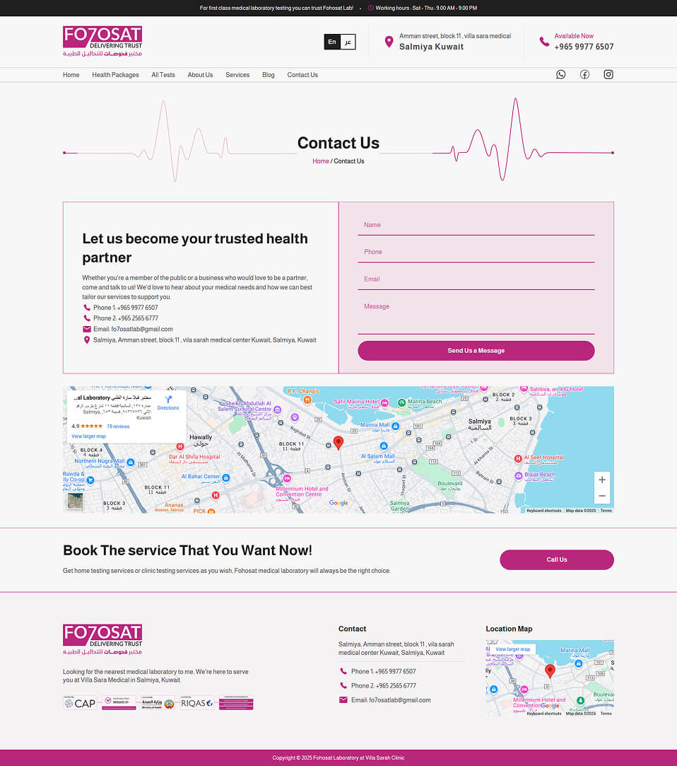
- Lab location and contact details in the hero section – Ensures visitors can easily find and reach the lab.
These elements create a sense of reliability, transparency, and accessibility, increasing trust and driving conversions.
plan step
Writing the website copy
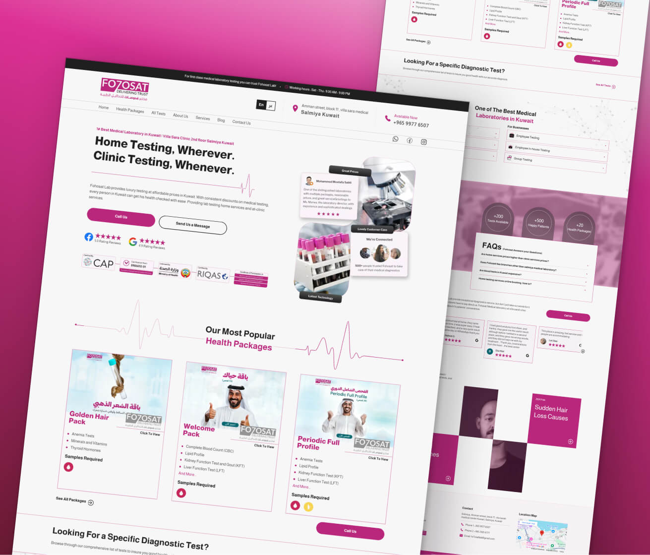
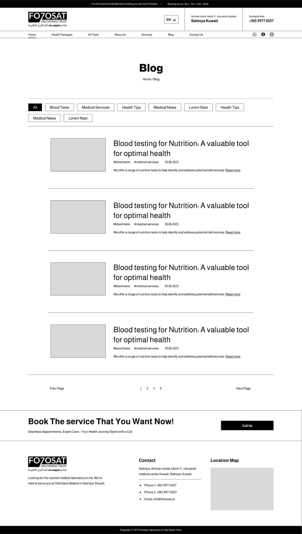
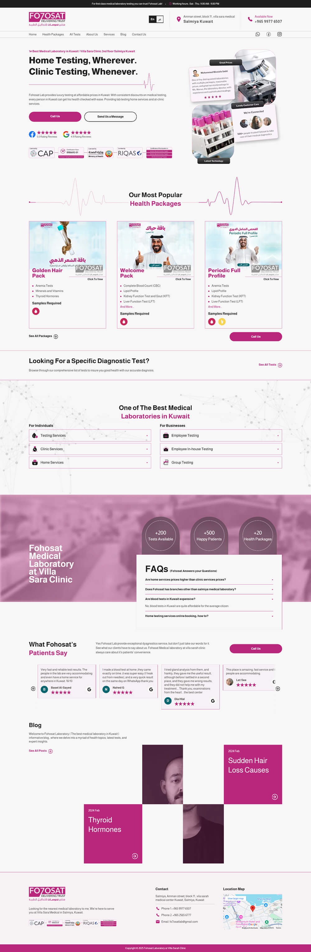
For the website copy, I focused on conveying speed and availability. The messaging needed to incentivize users to call by emphasizing the lab’s professionalism. I crafted headlines like "Home testing wherever, clinic testing whenever" to highlight broad accessibility and flexible service.
By focusing on a sense of convenience and reliability, the copy aimed to address any hesitation patients might have before reaching out.
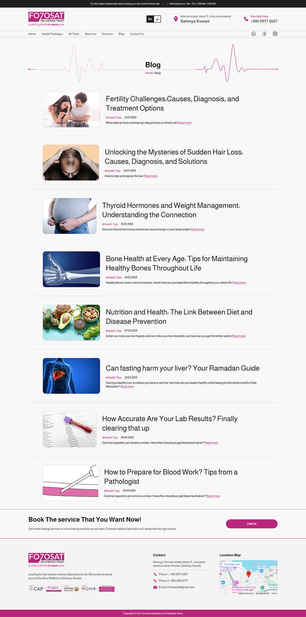
Planning out a wireframe
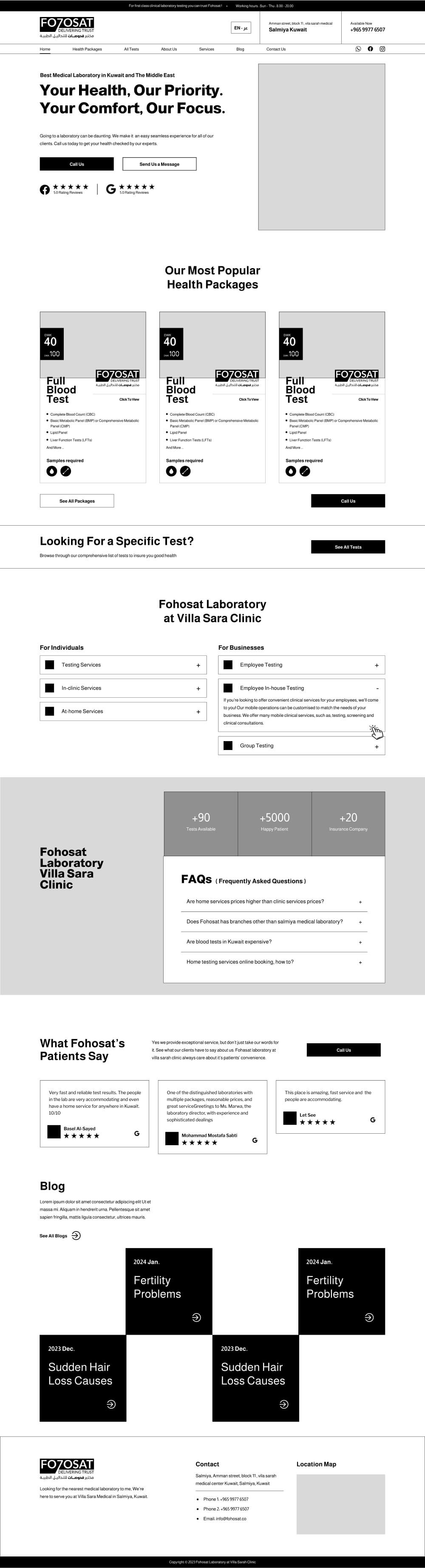
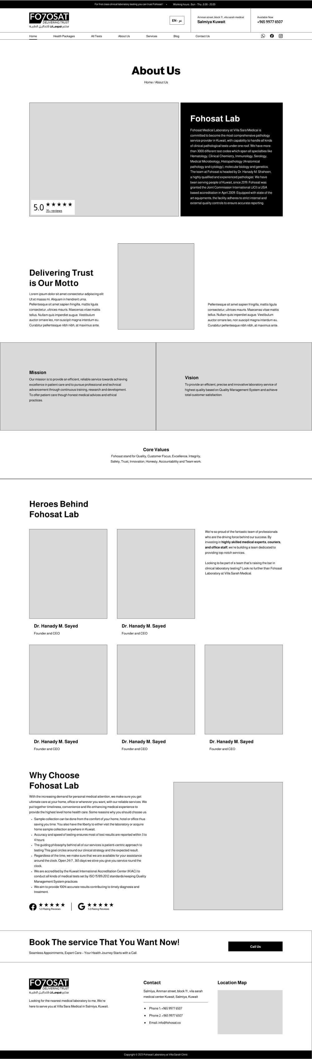
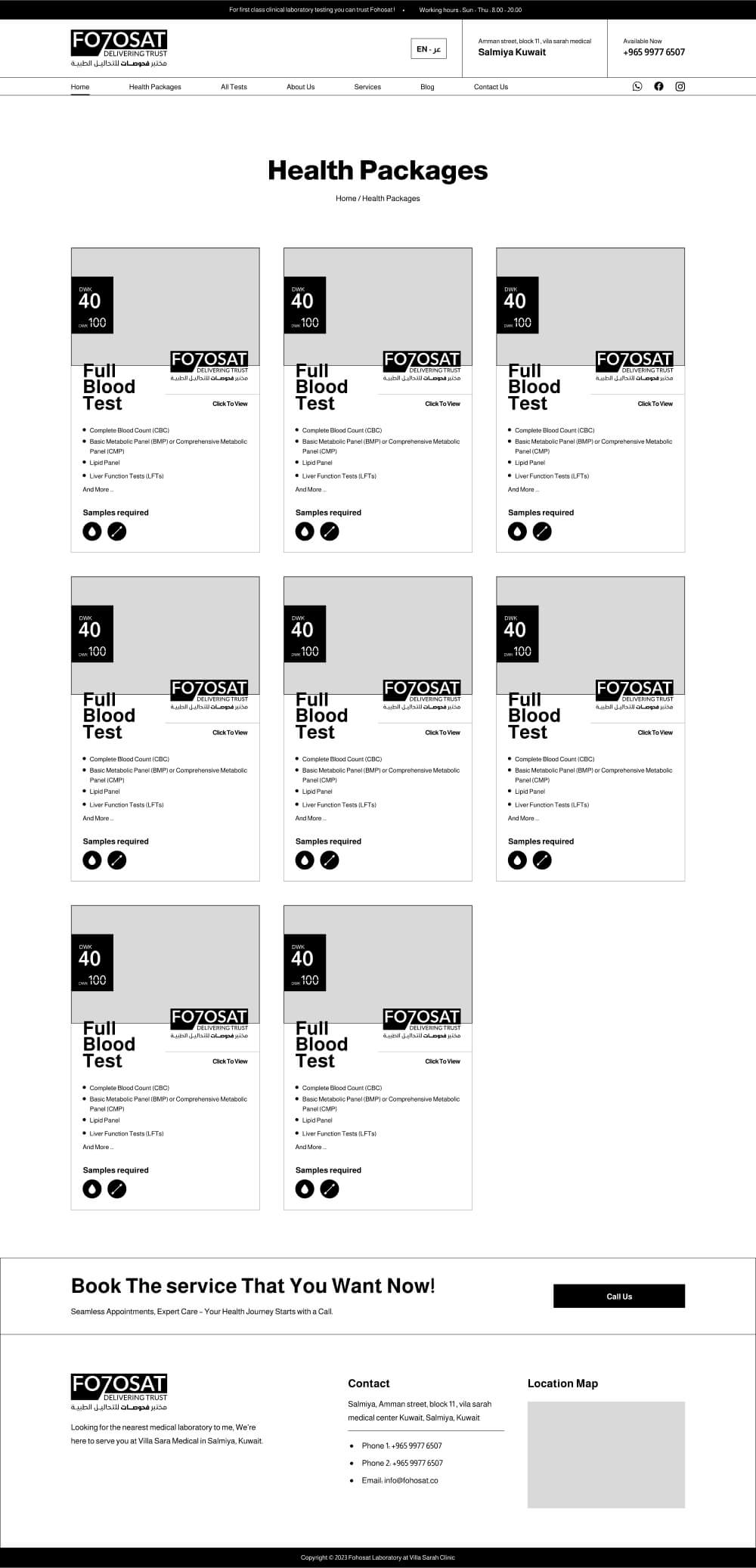
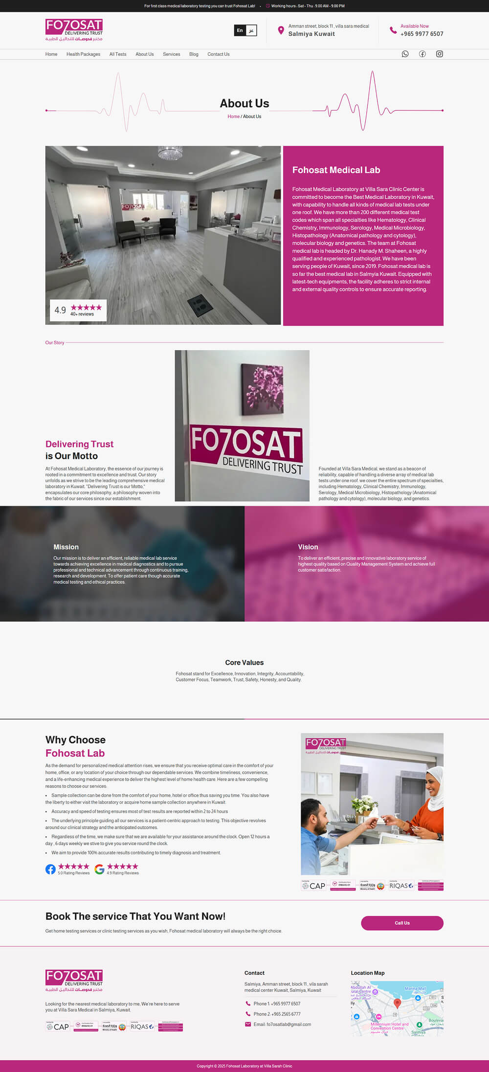
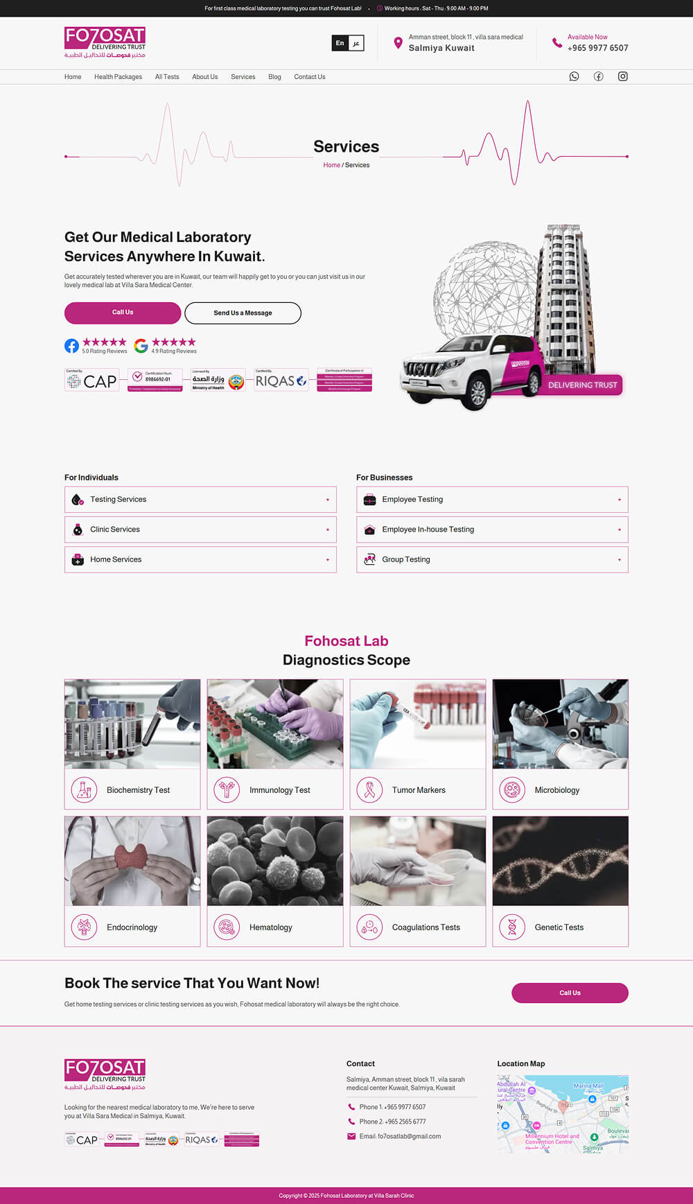
The wireframe was designed with a conversion-first approach, ensuring that key trust-building and action-driving elements were immediately visible. The accreditations, clinic rating, and a client testimonial were placed at the very top to encourage quick bookings and establish credibility right away.
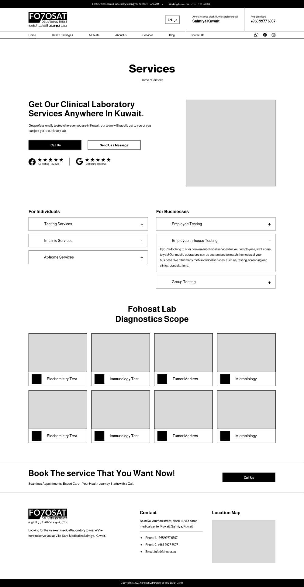
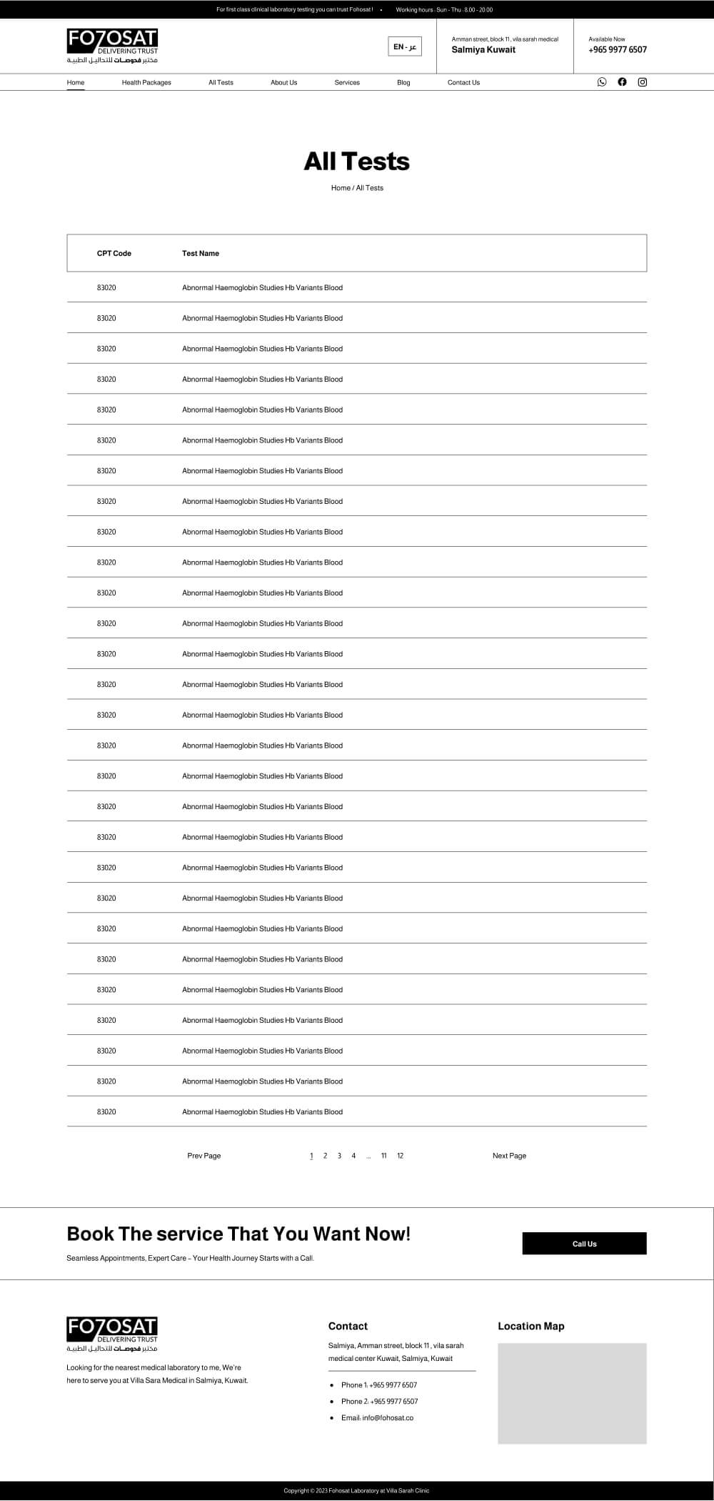
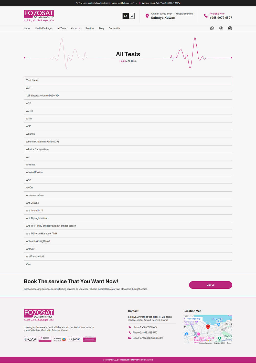
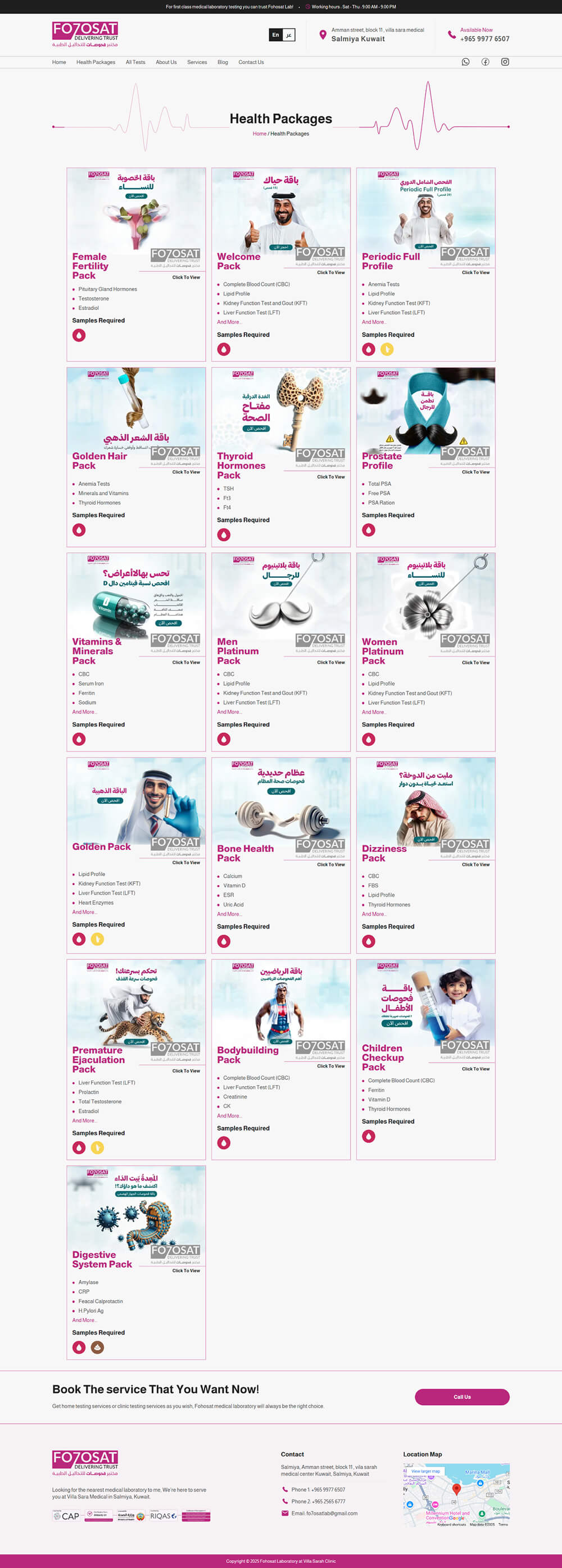
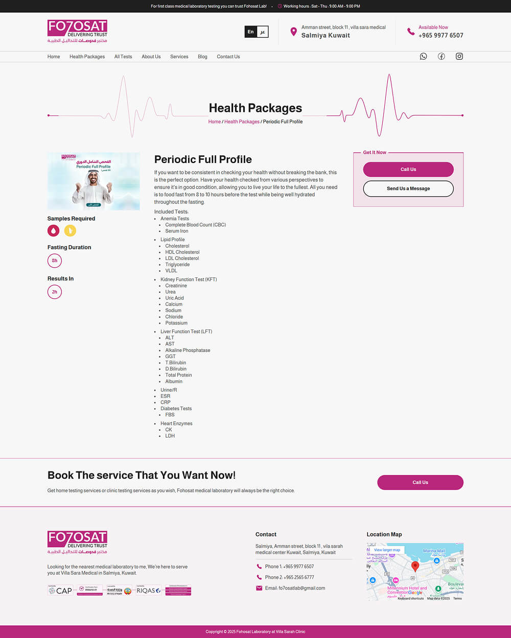
To enhance usability, I ensured easy access to communication methods like phone, whatsapp, social media profiles, and location details. The packages section was structured for quick scanning, helping visitors find the treatments they need effortlessly. Additionally, a dedicated section for the lab highlighted its experience and values, reinforcing trust and professionalism.
Preparing website assets
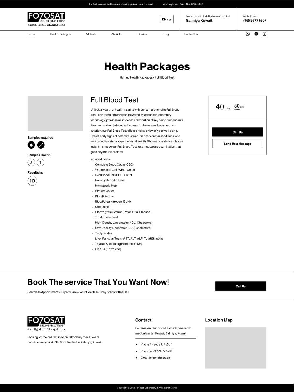
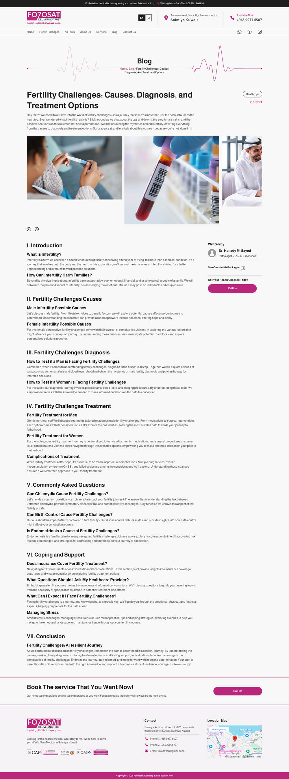
I created assets that captured the essence of the lab, featuring lab equipment, the lab’s van, and its building to establish familiarity and trust. On the medical tests pages, I used icons to represent the required sample instead of relying solely on text, making key information more visually engaging.
To reinforce the theme of vitality, I designed a sine pulse animation and incorporated it across all page headers, creating a subtle yet cohesive visual identity.
design step
Creating High-Fidelity UI
With the wireframe finalized and assets prepared, I focused on crafting a clean, visually balanced UI that converys Fohost’s professionalism without unnecessary complexity. The design used neat imagery, structured layouts, and smooth user flows to create an engaging yet effortless experience.
Every element was placed with purpose—reinforcing clarity, guiding users seamlessly, and ensuring the brand’s value was communicated effectively. The result was a polished, high-converting design that felt both professional and distinctive.
Title Animation
I created a pulse animation that symbolizes vitality and health, using it across all page headers to reinforce the lab’s theme.
develop step
Choosing the right tech-stack.
Since this was a static website, I prioritized speed, efficiency, and ease of maintenance. I chose Astro.js, a framework I’m highly comfortable with, as it allowed me to build a fast, lightweight website while keeping the development process smooth and efficient.


