Website design case study
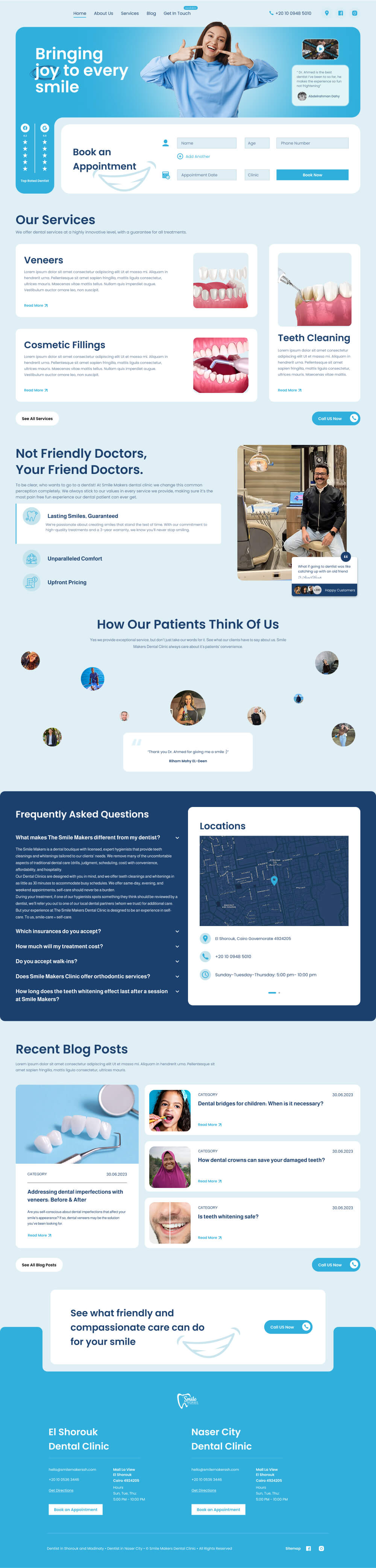
Smile Makers is a dental clinic that needed a website to serve as the final step in its marketing funnel, converting leads into booked appointments. I built the entire funnel, ensuring the website was designed for trust and high conversions. It provided an easy appointment booking system, clear communication channels like a phone number and location, and showcased the clinic’s services and medical team to establish credibility. To further build trust, the website featured client reviews, reinforcing the clinic’s reputation and encouraging potential patients to take action.
discover step
Who’s the Target Audience for Smile Makers?
The clinic primarily targets local patients seeking reliable dental care, ranging from young professionals and families to older adults needing specialized treatments. Many leads come from digital ads and referrals, so the website needed to be reassuring, informative, and easy to navigate, ensuring a seamless transition from interest to appointment booking.
What do competitors do?
Competitors focus on trust-building and conversion-driven strategies to quickly turn visitors into booked patients. Common tactics include:
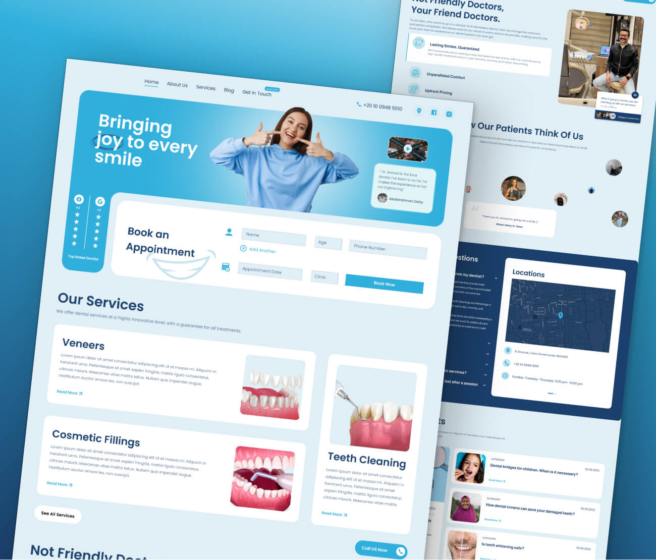
- Appointment form in the hero section – Ensures visitors can book immediately without scrolling.
- Introduction video at the top – Showcases the clinic, services, and medical team to build familiarity and credibility.
- Google and Facebook reviews displayed upfront – Uses social proof to reassure potential patients.
- Clinic location and contact details in the hero section – Makes it easy for visitors to know where the clinic is and how to reach them.
These elements create a sense of reliability, transparency, and accessibility, increasing patient trust and boosting conversions.
plan step
Writing the website copy
For the website copy, I focused on conveying warmth and friendliness, reflecting the personality of the clinic’s main doctor. The messaging needed to make patients feel comfortable and welcome, so I crafted headlines like:
- "Bringing joy to every smile." – Emphasizing a positive and uplifting experience.
- "Not Friendly Doctors, Your Friend Doctors." – Highlighting a personal, approachable connection with patients.
- "See what friendly and compassionate care can do for your smile." – Reinforcing the clinic’s patient-first approach
By focusing on a friendly and inviting tone, the copy made the clinic feel more approachable, easing any anxieties patients might have before booking an appointment.
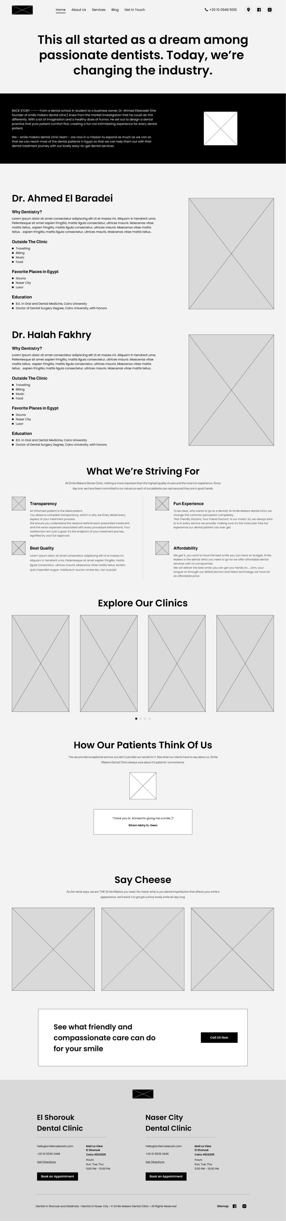
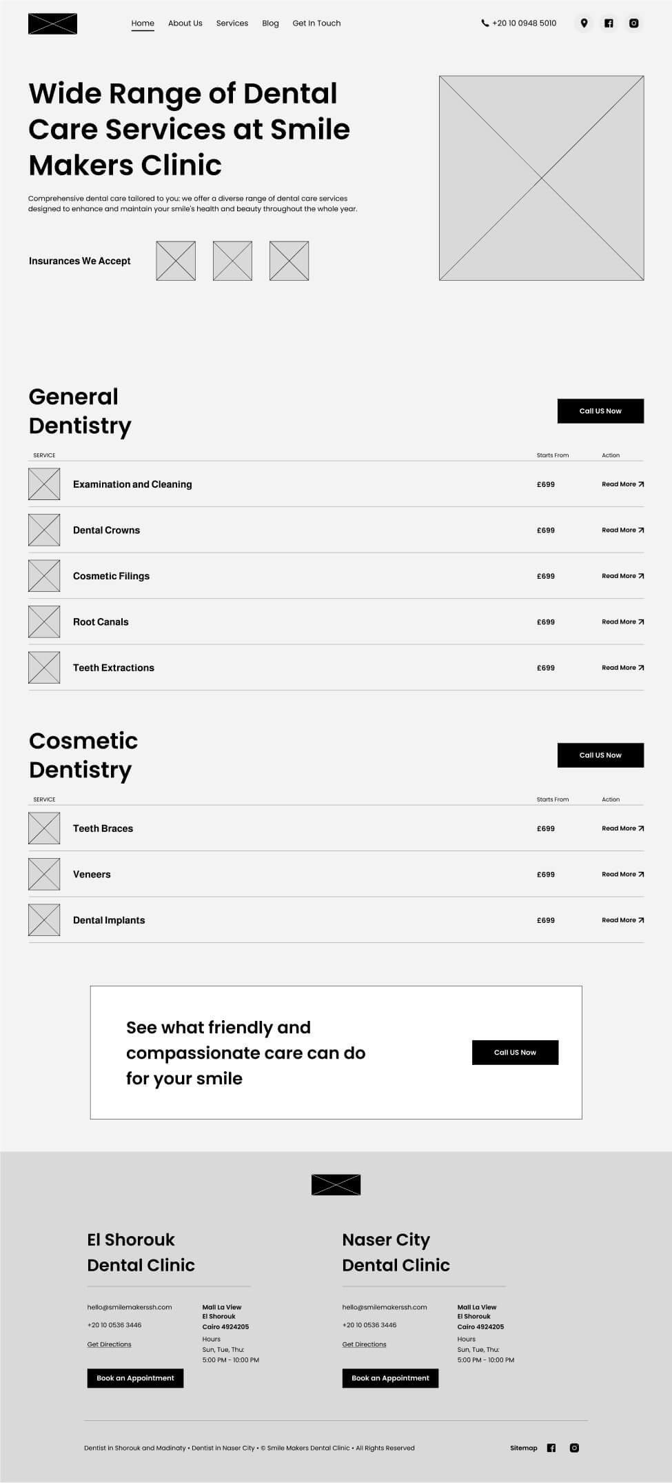
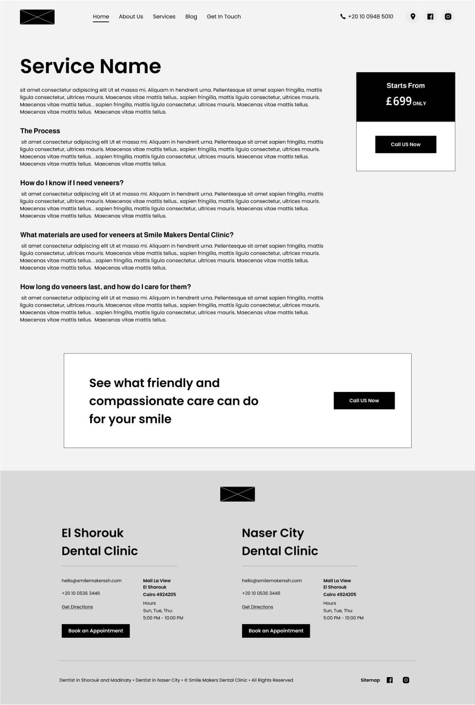
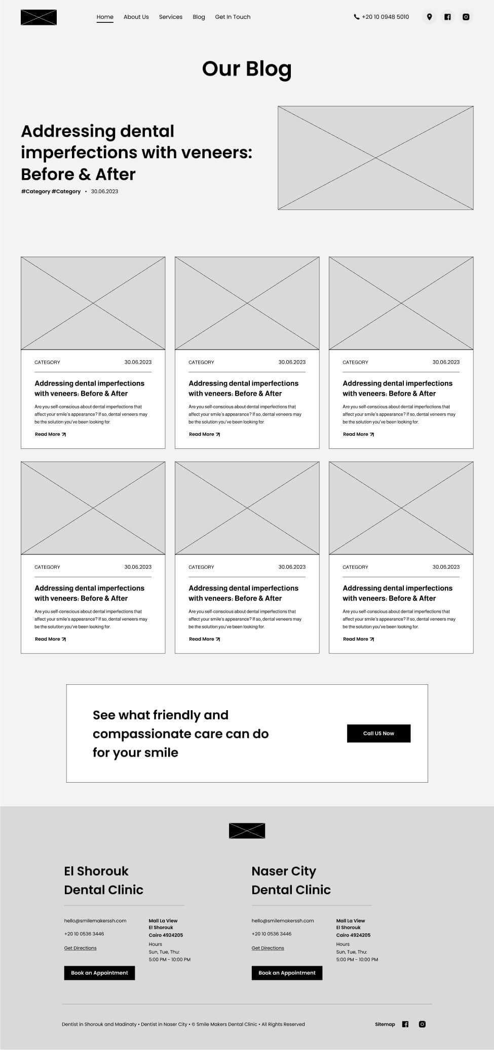
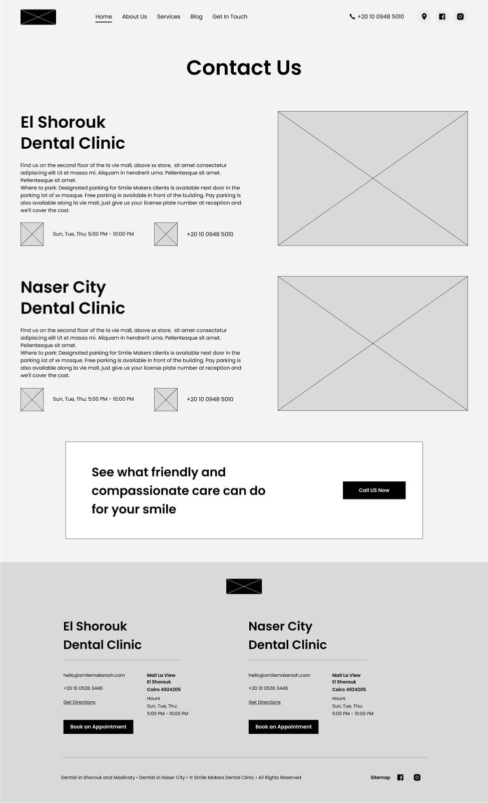
Planning out a wireframe
Since this was a one-page website, I structured the wireframe based on high-converting layouts while ensuring the brand’s message remained clear and impactful. The design prioritized smooth storytelling, strategic content placement, and conversion-driven sections to guide visitors seamlessly from interest to action.
Preparing website assets
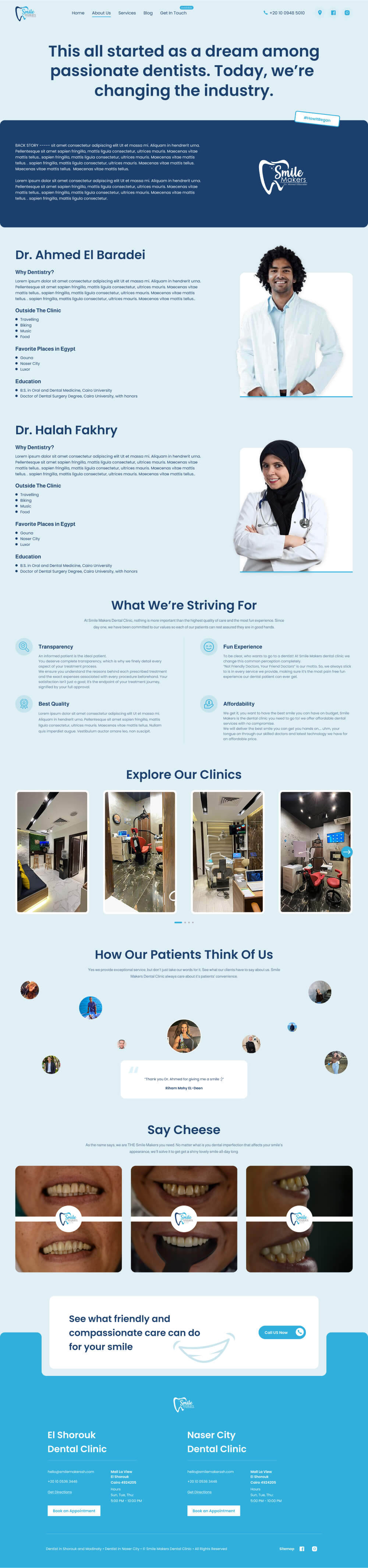
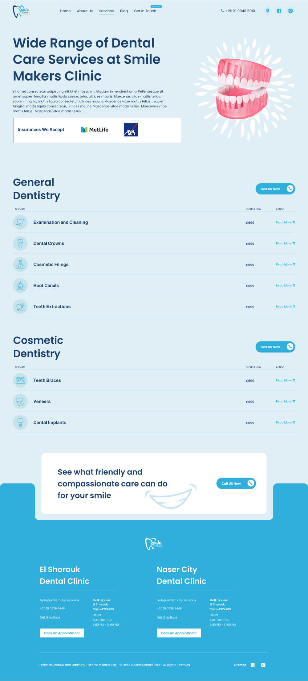
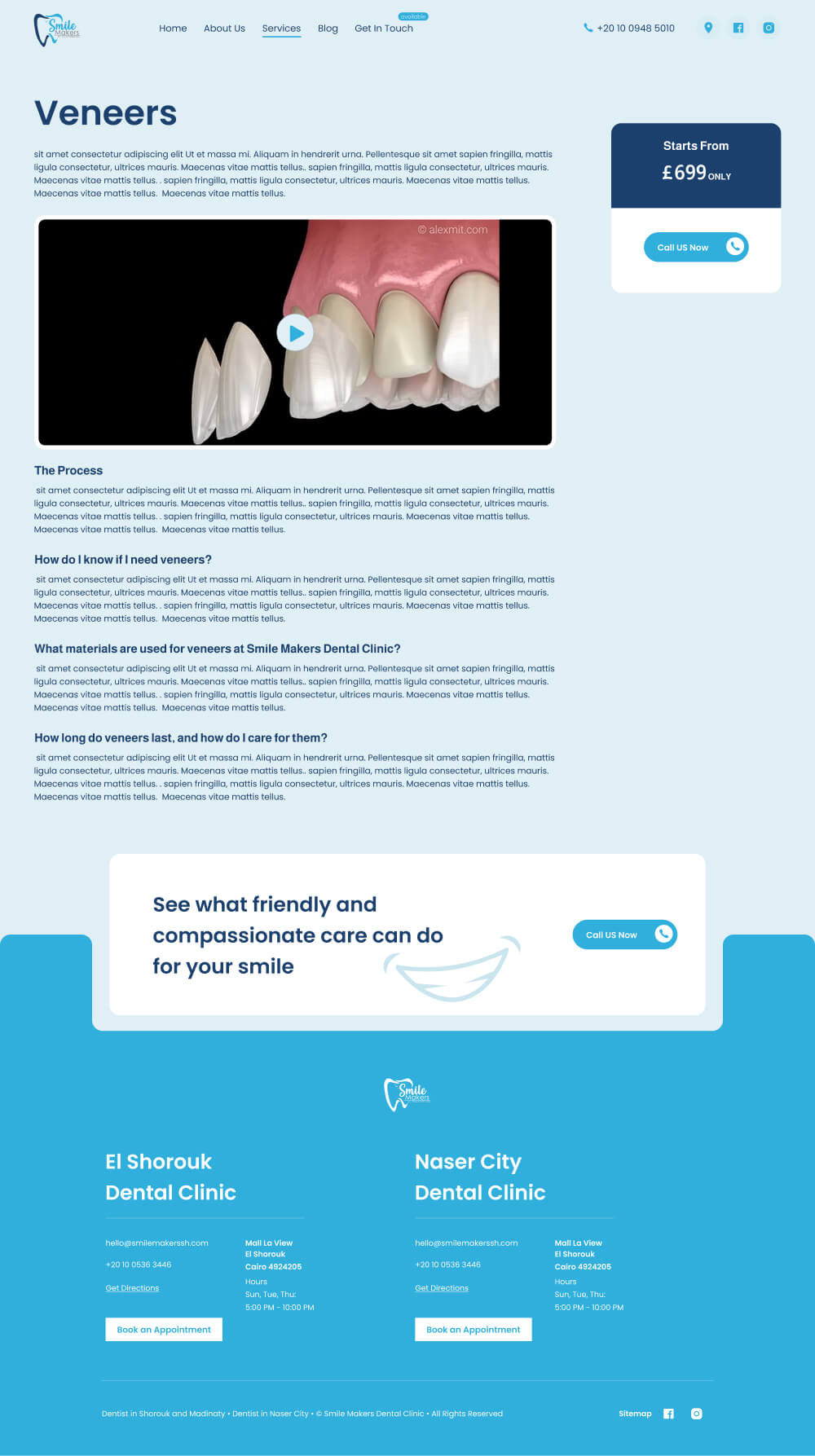
To visually represent the clinic’s services in a clear and engaging way, I used ready-made 3D assets that neatly illustrate each treatment. This helped simplify complex dental procedures while maintaining a modern, polished look.
Beyond that, I kept the design minimal and clean, ensuring a professional yet approachable feel. The color scheme was inspired by the clinic’s pre-existing logo, creating a cohesive and recognizable brand identity.

design step
Creating High-Fidelity UI
With the wireframe finalized and assets prepared, I focused on crafting a clean, visually balanced UI that converys Smile makers’ professionalism without unnecessary complexity. The design used neat imagery, structured layouts, and smooth user flows to create an engaging yet effortless experience.
Every element was placed with purpose—reinforcing clarity, guiding users seamlessly, and ensuring the brand’s value was communicated effectively. The result was a polished, high-converting design that felt both professional and distinctive.
develop step
Choosing the right tech-stack.
Since this was a static website, I prioritized speed, efficiency, and ease of maintenance. I chose Astro.js, a framework I’m highly comfortable with, as it allowed me to build a fast, lightweight website while keeping the development process smooth and efficient.


