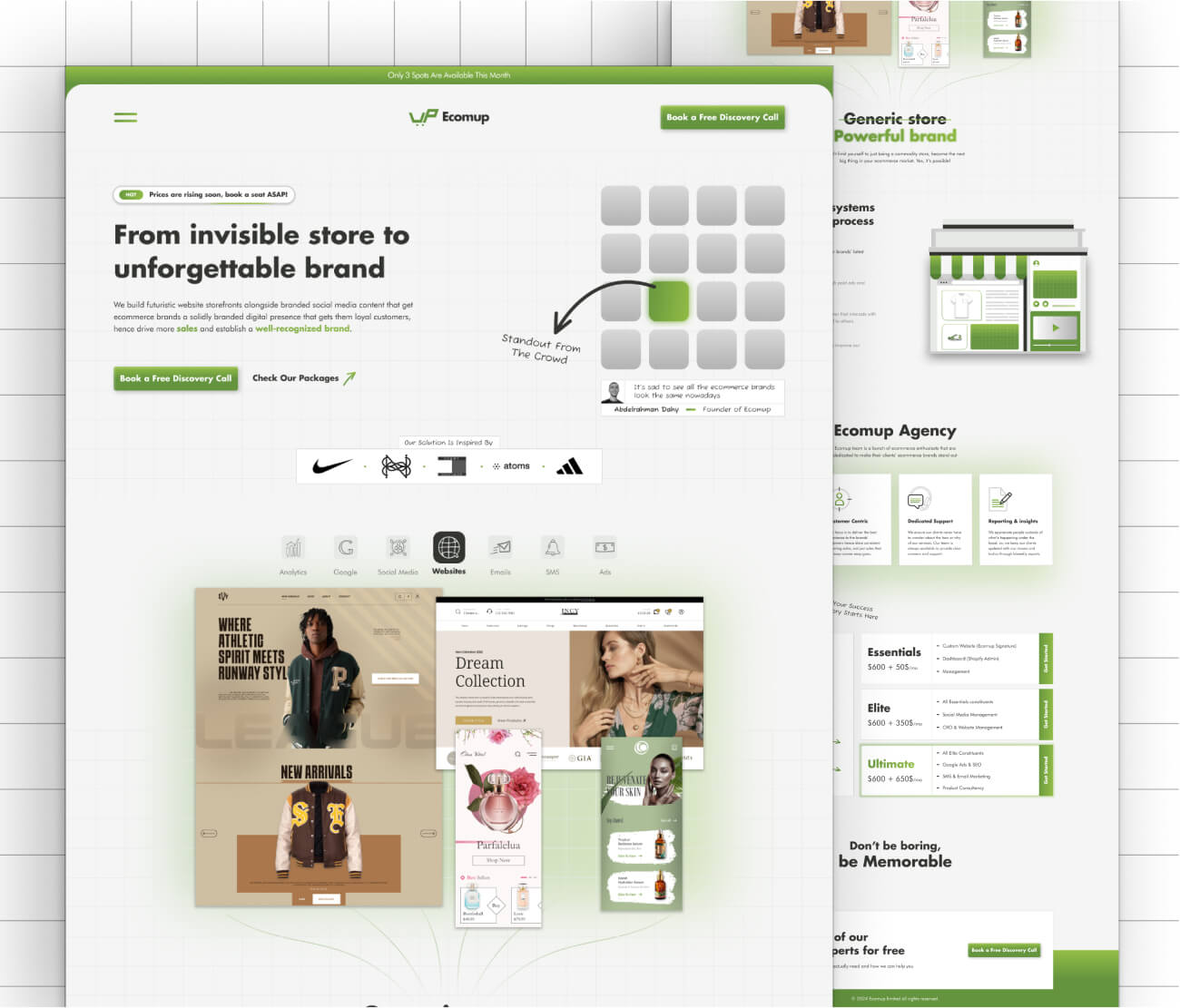
Website design case study
Ecomup is a marketing team I created and led. We offered almost every digital marketing service an e-commerce brand would need, but our signature service was custom Shopify website design. We needed a website that conveyed our messages: "Stand Out from the Market." & “Don’t be boring, be memorable.” Our services were all about making brands unique, so our own website had to reflect that—while also being optimized for high conversions.
discover step
Who’s the Ideal Customer for Ecomup?
Before designing the website, we needed to pinpoint Ecomup’s ideal customers to ensure the messaging and visuals spoke directly to them. What we found:
- E-commerce brand owners who want a custom, high-end online presence instead of blending in with generic templates.
- Businesses struggling to stand out, looking for a website and branding that truly sets them apart.
- Brands that prioritize storytelling, aiming for a seamless, immersive user experience across their website and social media.
Conclusion: Ecomup’s ideal customers aren’t just looking for a website—they want a digital presence that embodies their brand, resonates with their audience, and converts visitors into loyal customers. The website had to reflect that from the very first click.
What do competitors do?
To position Ecomup uniquely, I analyzed how competitors structured their websites and marketed their services. What we found:
- Heavy focus on results and case studies to establish credibility and showcase past successes.
- FOMO-driven marketing tactics like "Only a few spots left!" or "Limited-time discount!" to push leads into taking action.
- Conversion-optimized landing pages that prioritize urgency and social proof over strong branding.
Conclusion: While competitors focused on short-term persuasion tactics, Ecomup needed to take a different approach—emphasizing long-term brand value over urgency gimmicks. The goal was to create a website that felt more premium and strategic, making potential clients want to work with us because of our unique design approach, not just because of a temporary offer.
plan step
Writing the website copy
I crafted bold, direct messaging to reflect Ecomup’s core value—helping brands stand out. Headlines like "From invisible store to unforgettable brand," "Stand out from the crowd," and "Don’t be boring, be memorable" instantly communicate our mission: turning generic stores into powerful, unforgettable brands.
Planning out a wireframe
Since this was a one-page website, I structured the wireframe based on high-converting layouts while ensuring the brand’s message remained clear and impactful. The design prioritized smooth storytelling, strategic content placement, and conversion-driven sections to guide visitors seamlessly from interest to action.
Preparing website assets
To reinforce Ecomup’s branding and messaging, I created custom assets that visually conveyed our "Standout from the crowd" philosophy.
- A dynamic grid illustration with all elements in the same color except for one in an accent color, highlighted with an arrow and text emphasizing the brand’s unique approach.
- A step-by-step process section, where I designed custom illustrations for each phase:
- Storefront – A storefront with a social media feed as the door and a website as the window, symbolizing the foundation of an online presence.
- Attention – A product displayed on a pedestal with an engaged audience, representing visibility and attraction.
- Retention – A hand holding a magnet, pulling in the audience, illustrating customer retention.
- Feedback – A hand holding a pen pointing at a product, with a popup message giving feedback, showing the importance of refinement.
These assets weren’t just decorative; they visually supported the brand’s mission—helping e-commerce businesses attract, retain, and convert their audience effectively.

design step
Creating High-Fidelity UI
With the wireframe finalized and assets prepared, I focused on crafting a clean, visually balanced UI that delivers Ecomup’s message without unnecessary complexity. The design used neat illustrations, structured layouts, and smooth user flows to create an engaging yet effortless experience.
Every element was placed with purpose—reinforcing clarity, guiding users seamlessly, and ensuring the brand’s value was communicated effectively. The result was a polished, high-converting design that felt both professional and distinctive.

Past work section
I made a tab-window structure where the user can click on the service icon and the relevant past work will pop up, the websites service is chosen by the default.
Our Process Section
To emphasize the meaning behind each step, I made an illustration for each step, and made the navigation through the steps by scrolling to make the user go through each step of the process.
develop step
Choosing the right tech-stack
Since this was a static single-page website, I prioritized speed, efficiency, and ease of maintenance. I chose Astro.js, a framework I’m highly comfortable with, as it allowed me to build a fast, lightweight website while keeping the development process smooth and efficient.


